 May 9, 2026
 Jewelry Photo Editing: How to Touch Up AI Renders Without Switching Apps
You just got a render back that's almost exactly right. The proportions are perfect, the stone has real depth, but the overall tone is a touch cold and the highlights on the band are washed out. What do you do?
The usual answer is: download the image, open Lightroom or Photoshop, make the adjustments, re-export, then re-upload. It works, but it adds three steps every time you need a minor correction, and that compounds fast when you're moving through a collection.
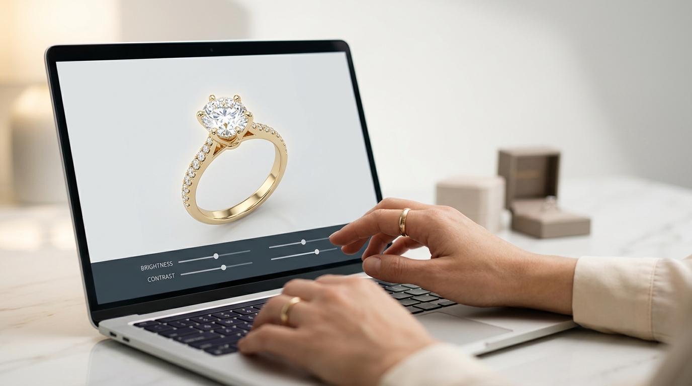
Studio's Image Editor is a dedicated jewelry photo editing screen that lives inside your project workspace. Open it from the File menu, adjust with a live preview, save back to the project, and download when you're ready. No context switch, no extra tools, no file juggling.
Here's what it actually does.
Opening the Image Editor
From any project, select the image you want to work on and go to Asset >Edit Image. The editing screen opens with your image on the left and all the controls on the right. Every adjustment updates the preview in real time, so you're always looking at the real result, not an estimate of what it might look like on export.
When you're satisfied, you can save by exporting a finished PNG.
Jewelry Photo Editing Basics: Tone, Contrast, and Color
Four sliders cover the foundation of how an image looks: brightness, contrast, saturation, and hue rotation.
AI-generated renders sometimes come out with slightly blown highlights, especially on polished metal surfaces. A modest brightness reduction paired with a contrast increase usually resolves that and makes the piece look more like something photographed in a real light setup rather than rendered in a vacuum.
Saturation controls how vivid the colors read. Yellow gold that looks a bit muted on screen often benefits from a small lift. Go conservatively, especially on colored stones, because oversaturation quickly starts to look synthetic in ways that are hard to ignore once you see them.
Hue rotation is the one most people skip. It shifts all colors around the color wheel simultaneously, which sounds drastic, but a small rotation can correct a metal tone that came out slightly off without forcing you to regenerate the whole image. Worth trying before you give up on an otherwise solid render.
A practical order: set color temperature first (next section), then brightness and contrast, then saturation. Temperature shifts affect how bright and saturated things appear, so locking it in first means you're not chasing your own adjustments.
Color Temperature
This slider simulates the difference between warm incandescent light and cool daylight. For most jewelry, neutral to slightly warm sits in the right range. It flatters both yellow and white metals and keeps the image from reading like it was shot under fluorescent office lighting.
If your render has a noticeable blue cast, warming it slightly is usually the fastest fix. The reverse applies too: cooling the temperature a little makes platinum and white gold look sharper and more premium.
Start here before reaching for hue rotation. Temperature is a more natural adjustment and easier to reverse if you overshoot.
Filters and Depth Effects
The three photographic filter toggles (grayscale, sepia, color inversion) are mostly stylistic, but grayscale is more useful for jewelry work than it sounds. Switching to grayscale for a moment is a fast way to check whether a design's shapes, proportions, and depth read clearly without color doing any of the work. Worth keeping in mind when you're evaluating structure rather than aesthetics, or when you're preparing images for monochrome print documents.
The depth effects are where things get interesting for product presentation.
Blur mimics shallow depth of field, the kind a macro lens produces in a real studio shoot where the center stays sharp and the edges soften. A light touch works well. Heavy blur looks like an error rather than a creative choice.
Vignette darkens the corners, drawing the eye toward the center of the frame. Product photographers often use this. The effect should be subtle enough that most people don't consciously notice it, just feel it.
Film grain adds texture. AI renders can look slightly too clean and digital, especially compared to product shots taken with a real camera. A small amount of grain moves an image toward something that reads more like a photograph, which works well for editorial or lifestyle-adjacent presentations.
Saving and Exporting Your Edited Jewelry Photo
Download Edited Image exports a full-resolution PNG with all adjustments baked in. This is what you'd use for e-commerce listing uploads, catalog documents, client presentations, or anywhere you need the final image outside Studio.
When Jewelry Photo Editing Makes More Sense Than Regenerating
Not every render needs editing. But a few situations make the Image Editor the right first move before you decide to regenerate:
When a generation nails the design but has a tonal problem, like the wrong temperature, flat contrast, or muted metal, fixing it here is faster and cheaper than running a new generation. The design is already correct; the look just needs adjustment.
When you're building a catalog from renders generated across multiple sessions, the tone controls let you normalize brightness and contrast across the set so everything looks consistent when placed side by side.
When you want an editorial or lifestyle look rather than a straight product shot, the depth effects give you options that text prompts alone can't reliably reproduce.
If you haven't used it yet, pick one render from your current project that's close but not quite right, and give the sliders two minutes. Most adjustments don't take more than that.
Recent Posts
Lab-Grown Diamond Jewelry Design: How to Generate, Specify, and Price LGD Pieces
Lab-grown diamonds now account for a significant share of jewelry sales, but the workflow for designing, specifying, and pricing LGD pieces with AI has never been well-documented. Here's the full cycle in Diatech Studio — from generating renders to setting up LGD rates in your Price Book and checking inventory before you quote.
Jewelry Video Background Removal: How to Turn Any Product Clip Into a Scene-Ready Asset
Most jewelry product videos have their background baked in from the start — making them hard to reuse across different website themes, ad templates, and social formats. Studio's Matte Video tool strips any jewelry video background in one step, giving you clean isolated footage you can drop into any scene without a video editor.
Jewelry Product Videos With Audio: How to Go From Still Image to Social-Ready Clip in One Step
Most jewelers use multiple tools to get a scored, ready-to-post product video. Studio's Videography tool lets you pick duration and audio together in one submission — no separate music step, no timeline editing. Here's how to use it and where it fits into a practical jewelry marketing workflow.