 Sep 19, 2026
 Compare Jewelry Design Variations Side by Side Instead of Guessing
You generate five variations of the same ring. They all look almost right. One has a slightly thicker band. Another moved the halo stones a hair closer together. A third just feels off and you can't say why. So you open three browser tabs, flip between them, squint, and eventually pick one based on a hunch instead of an actual look at what changed.
That's the problem Compare Variations is built to fix. Learning how to compare jewelry design variations properly, instead of flipping between tabs, is a small habit that saves you from shipping the wrong one.
What the tool actually does
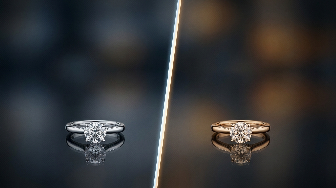
Compare Variations puts two of your generated images directly on top of each other in a single popup, with a vertical divider running down the middle. Drag that divider left or right and it wipes one image away to reveal the other underneath, at the exact same position and zoom. You're not comparing two separate windows anymore. You're looking at one image transform into the other in real time.
Pick it from the toolbar with two variations selected, or open it from the thumbnail strip when you're already deep in a project. Either way it opens instantly, no loading screen, no exporting anything first.
Why comparing jewelry design variations side by side beats flipping tabs
Human eyes are bad at holding two images in memory and spotting a difference between them. You've probably done the trick where you flip back and forth between two browser tabs trying to catch what moved. It works for big changes. It falls apart for the small stuff, which in jewelry design is most of what actually matters.
A prong that's a millimeter taller. A stone that sits 2 degrees off from symmetrical. A metal tone that's warmer than you intended. These are exactly the kind of differences that decide whether a client says yes or asks for another round, and they're also exactly the kind of thing your brain glosses over when you're switching context between two separate views.
With a wipe divider, the two images share the same frame. Your eye isn't relocating anything, it's just watching one region change as you drag. That's a much easier comparison for your visual system to make, and it's why designers who compare variations this way tend to catch small issues faster than people scrubbing through a thumbnail strip.
Fine control with the keyboard
Dragging with a mouse is fine for a quick look, but arrow keys give you finer control once you've spotted something worth a closer look. Nudge the divider a pixel at a time across the exact spot where you think something's different, band width, stone placement, a setting detail, and you can confirm it instead of guessing. This matters more than it sounds like it should. A lot of "which one do I send the client" decisions come down to details this small, and a rough drag with a mouse just isn't precise enough to settle them.
Where comparing variations fits into a real workflow
I'd use it in three spots without thinking twice:
Right after a batch generation, before you narrow anything down. Instead of scrolling the thumbnail strip and picking on gut feel, pull the two strongest candidates into compare mode and actually look at what separates them.
Before a client call, when you want to walk someone through why option A beats option B. Screen-sharing a wipe comparison is a much better way to make your case than describing the difference in words while they stare at two static thumbnails.
After a targeted edit, to confirm the AI changed only what you asked it to change and didn't quietly shift something else in the process. This one catches more than you'd expect. An edit aimed at the setting can sometimes nudge the overall proportions just slightly, and a side by side comparison is the fastest way to notice before it ships.
A quick habit worth building
None of this requires changing how you work. You're already generating variations and already deciding which one moves forward. The only change is doing that decision inside the compare view instead of eyeballing a row of thumbnails. Next time you've got two close variations sitting in a project, open Compare Variations and drag the divider across the areas you're unsure about. It takes less time than reading this paragraph, and it's the difference between picking a design because it looks right and picking it because you actually checked.
Recent Posts
Jewelry Design Studio Reporting: How to See Credit Usage, Task Productivity, and Worklogs in One Place
A walkthrough of Diatech Studio's credit usage, task productivity, and worklog reports, so studio owners and team leads can catch overloaded designers, expensive workflow habits, and slipping projects before they become real problems.
Voice AI Jewelry Design: What Changes When You Talk Instead of Type
A look at Diatech Studio's Live voice conversation mode: how real-time, two-way spoken design sessions differ from one-way voice prompts, and when to actually use them with clients.
Jewelry CAD Export: How to Get From 3D Render to Manufacturing-Ready File
A practical walkthrough of Diatech Studio's Clean CAD, OBJ/STL export, and turntable recording tools, so your AI-generated 3D jewelry model turns into a file your manufacturer can actually use.